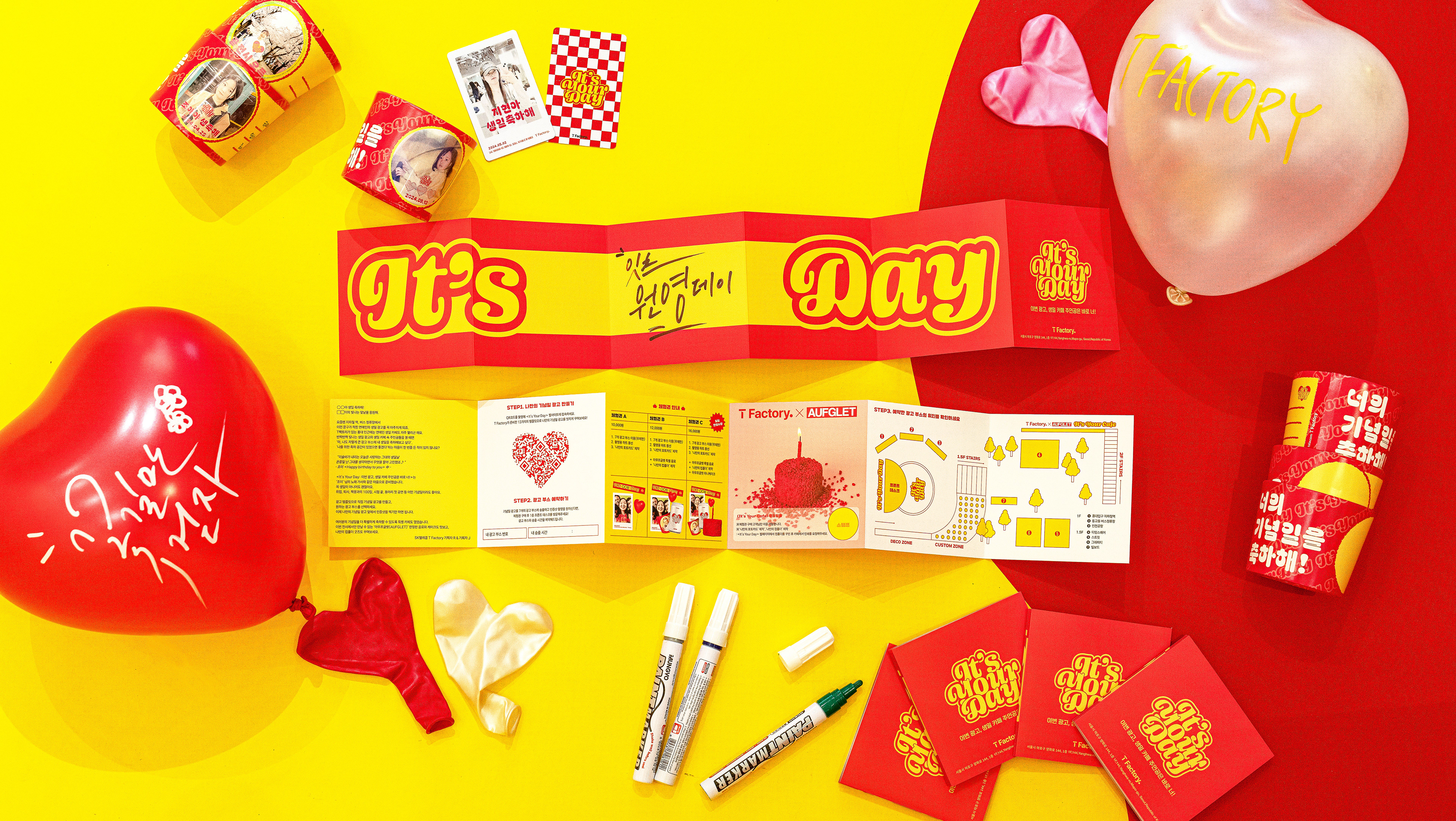
With the renewal of Musicow’s 2.0 service and its global launch in the U.S., we undertook a range of improvements to elevate the overall user experience of the brand.
As part of this effort, we initiated the development of 3D assets to replace the outdated in-app visuals and to deliver a more cohesive and consistent brand experience.
As part of this effort, we initiated the development of 3D assets to replace the outdated in-app visuals and to deliver a more cohesive and consistent brand experience.
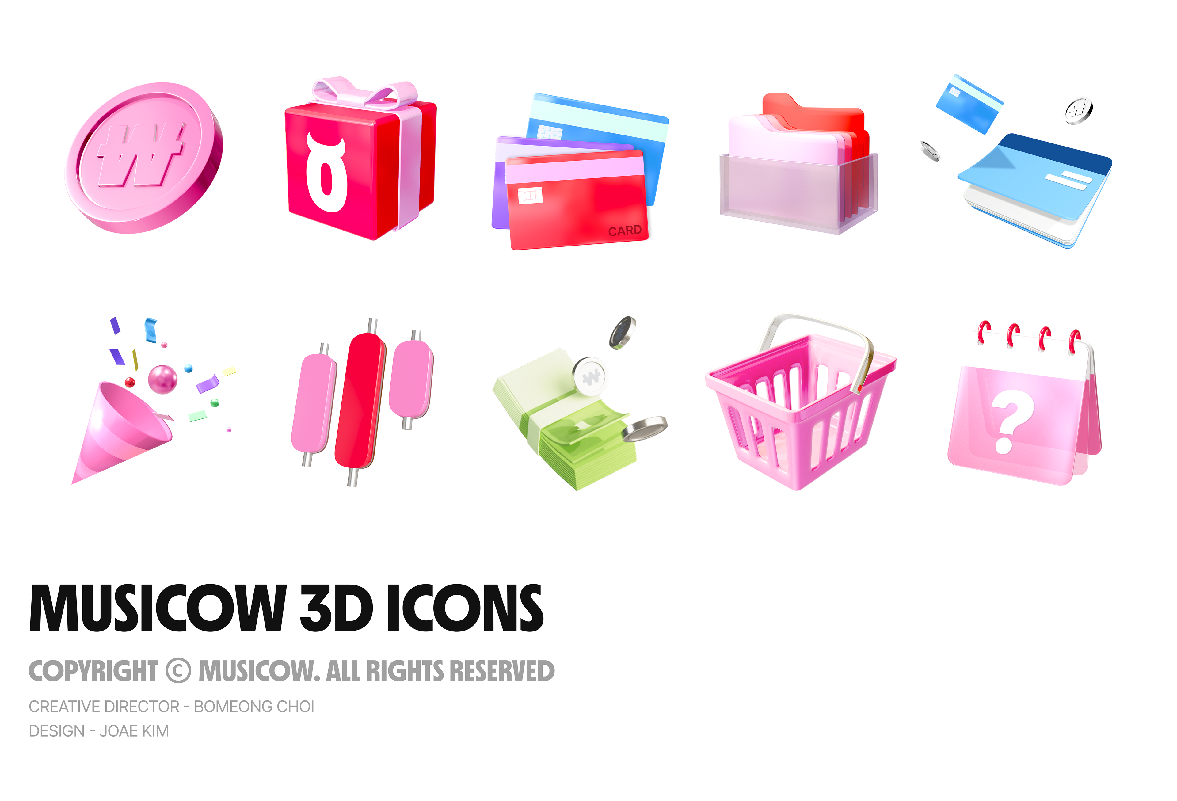
The 3D icons were designed based on Musicow’s KR color palette, moving away from the previously dull and dark
aesthetics. Instead, they were crafted with vibrant colors and dynamic forms.
Through this, we aimed to enhance usability not only within the app but also across marketing materials and internal and external communications, ultimately strengthening brand recognition and visual engagement.
aesthetics. Instead, they were crafted with vibrant colors and dynamic forms.
Through this, we aimed to enhance usability not only within the app but also across marketing materials and internal and external communications, ultimately strengthening brand recognition and visual engagement.
-
뮤직카우의 2.0 서비스 리뉴얼과 미국 글로벌 서비스 런칭을 계기로, 브랜드 전반의 사용자 경험을 한층 강화하고자 다양한 개선 작업을 진행했다.
그중 하나로,오랜 기간 노후화된 상태로 사용되어 오던 앱 내 시각 자산들을 정비하고 더욱 통일감 있고 일관된 브랜드 경험을 제공하기 위해
3D 에셋 개발을 기획했다.
그중 하나로,오랜 기간 노후화된 상태로 사용되어 오던 앱 내 시각 자산들을 정비하고 더욱 통일감 있고 일관된 브랜드 경험을 제공하기 위해
3D 에셋 개발을 기획했다.
3D 아이콘은 KR 브랜드의 컬러칩을 기반으로 제작했으며
기존의 어둡고 칙칙한 디자인에서 벗어나 활기차고 다채로운 색감과 생동감 있는 형태감을 갖추도록 설계했다.
이를 통해 앱은 물론, 마케팅 및 대내외 커뮤니케이션 전반에서의 활용도를 높이고 브랜드 인지도와 몰입감을 동시에 향상시키고자 했다.
기존의 어둡고 칙칙한 디자인에서 벗어나 활기차고 다채로운 색감과 생동감 있는 형태감을 갖추도록 설계했다.
이를 통해 앱은 물론, 마케팅 및 대내외 커뮤니케이션 전반에서의 활용도를 높이고 브랜드 인지도와 몰입감을 동시에 향상시키고자 했다.
3D Design : Zoae Kim
Ceative Director : Bomeong Choi
Ceative Director : Bomeong Choi