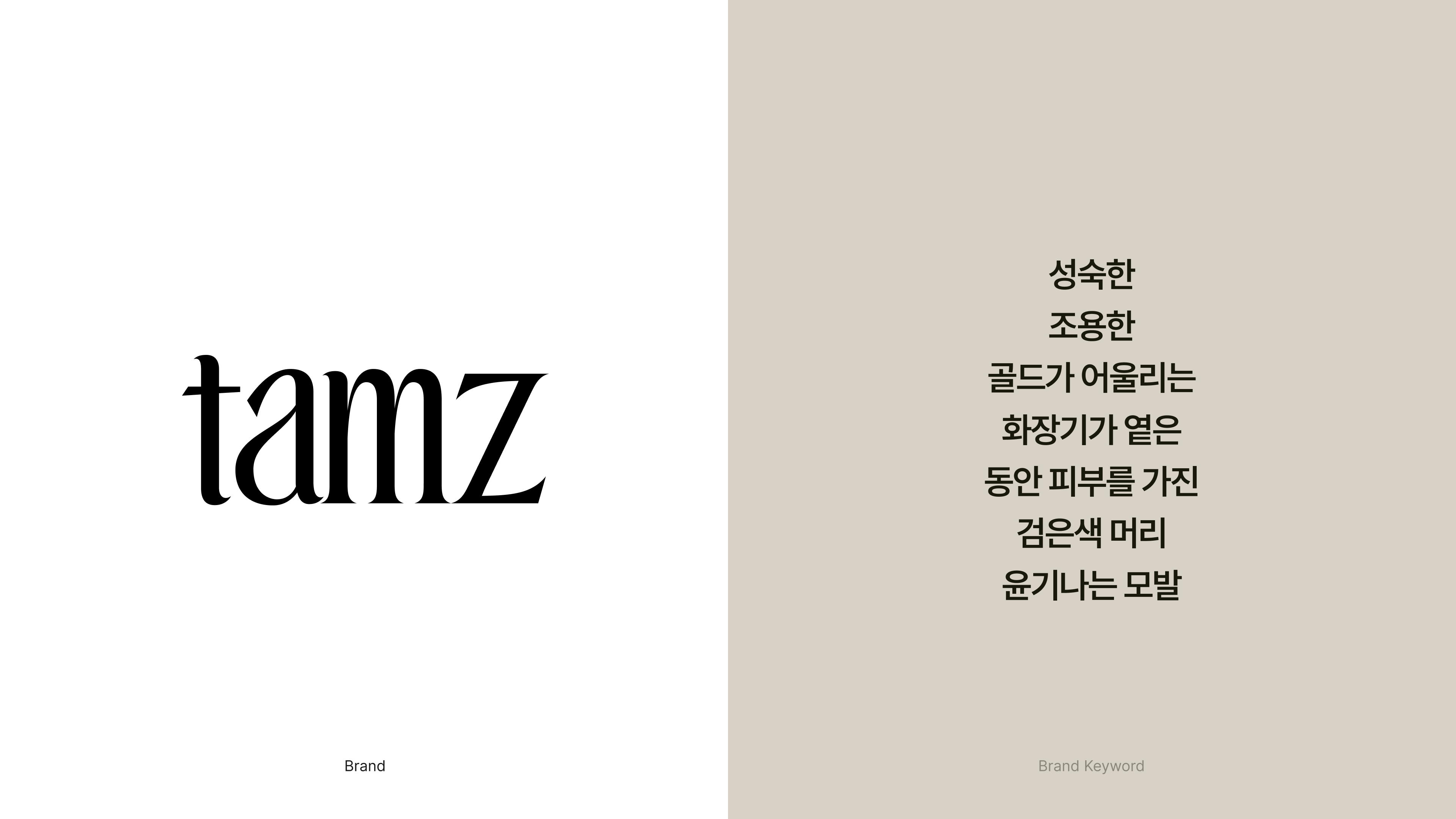
TAMZ is a hair care brand that makes ‘excellent professional-level products’ directly used, verified, and recommended by hair experts working in the field available to general consumers. TAMZ uses a shell holding a pearl as its brand concept to solidify its brand identity and develop its story.The main concept of the brand was set to establish itself as a brand with natural beauty that is coveted like a shell with pearls. An identity was given so that the same message could be felt in the subsequent branding, graphics, and packaging.
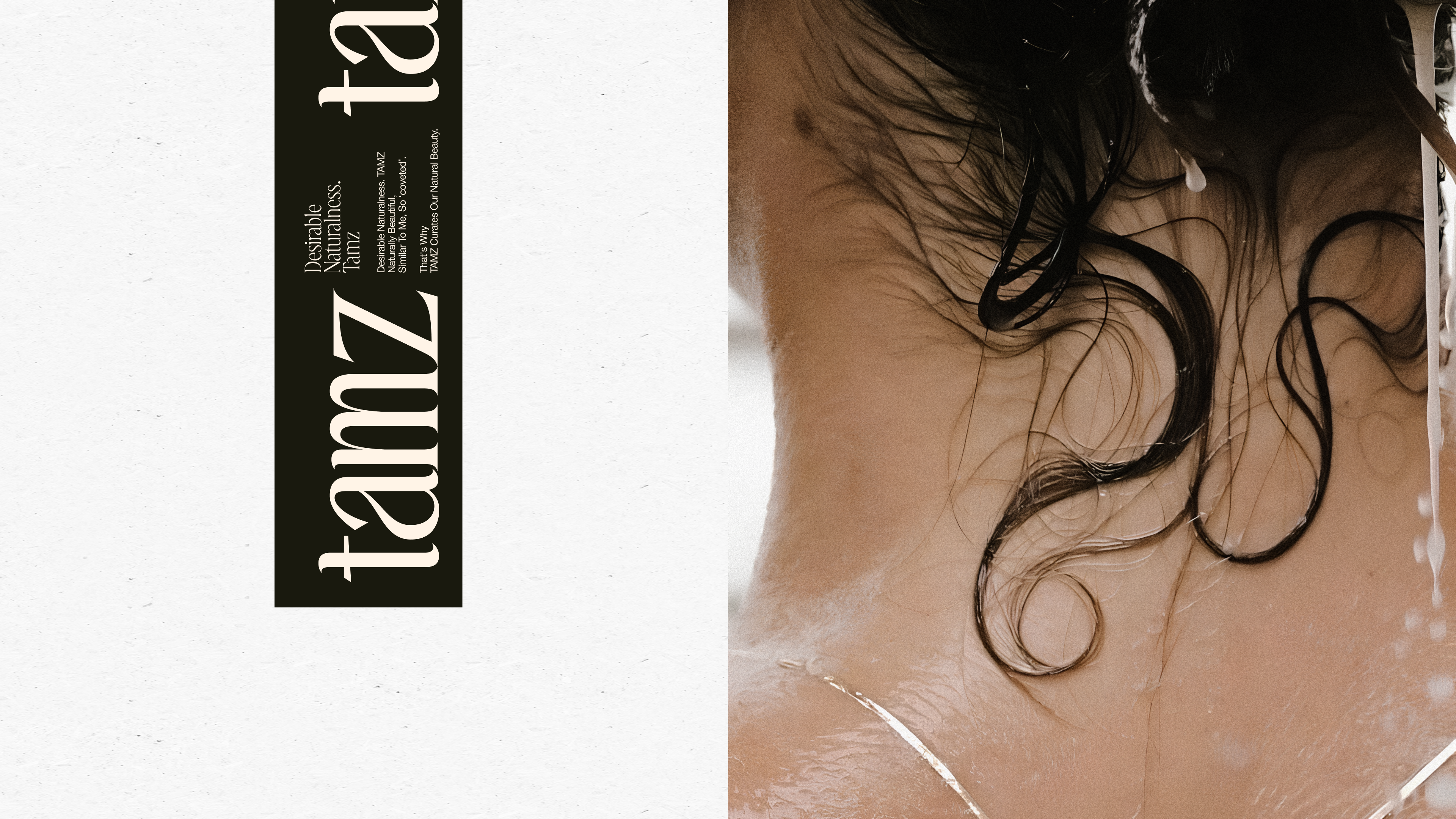
" Naturally beautiful, similar to me, and therefore ‘coveted’. "
" Naturally beautiful, similar to me, and therefore ‘coveted’. "
The current hair market is extremely trendy and trendy,
with people trying to show their own unique styling. We're all caught up in the trend.
TAMZ positions naturalness in thisWe want to become a brand that curates
our natural beauty.
TAMZ(탐즈)는 현업에 종사중인 헤어전문가가 직접 사용,검증하고 추천하는
‘전문가 수준의 뛰어난 제품’을 일반 소비자도 사용할 수 있도록 만든 헤어케어 브랜드입니다.
‘전문가 수준의 뛰어난 제품’을 일반 소비자도 사용할 수 있도록 만든 헤어케어 브랜드입니다.
TAMZ는 진주를 품고있는 조개를 브랜드의 컨셉으로 삼아 브랜드의 아이덴티티를 확고히 하여 스토리를 전개합니다.
진주를 품은 조개처럼 탐나는 자연스러움을 품은 브랜드로 자리잡을 수 있도록 브랜드의 메인컨셉을 설정하였고
이어지는 브랜딩과 그래픽, 패키지에서도 동일한 메세지가 느껴질수있도록 아이덴티티를 부여하였습니다.
진주를 품은 조개처럼 탐나는 자연스러움을 품은 브랜드로 자리잡을 수 있도록 브랜드의 메인컨셉을 설정하였고
이어지는 브랜딩과 그래픽, 패키지에서도 동일한 메세지가 느껴질수있도록 아이덴티티를 부여하였습니다.
자연스럽게 아름다운, 나와 닮은것같은, 그래서 ‘탐나는’.
현재 헤어시장은 극도의 트렌디함과 유행, 자신만의 독창적인 스타일링을 보여주려는
트렌드속에 몰려있습니다. TAMZ는 이 속에서 자연스러움을 포지셔닝하여
우리의 자연스러움을 큐레이션하는 브랜드가 되고자합니다.
트렌드속에 몰려있습니다. TAMZ는 이 속에서 자연스러움을 포지셔닝하여
우리의 자연스러움을 큐레이션하는 브랜드가 되고자합니다.


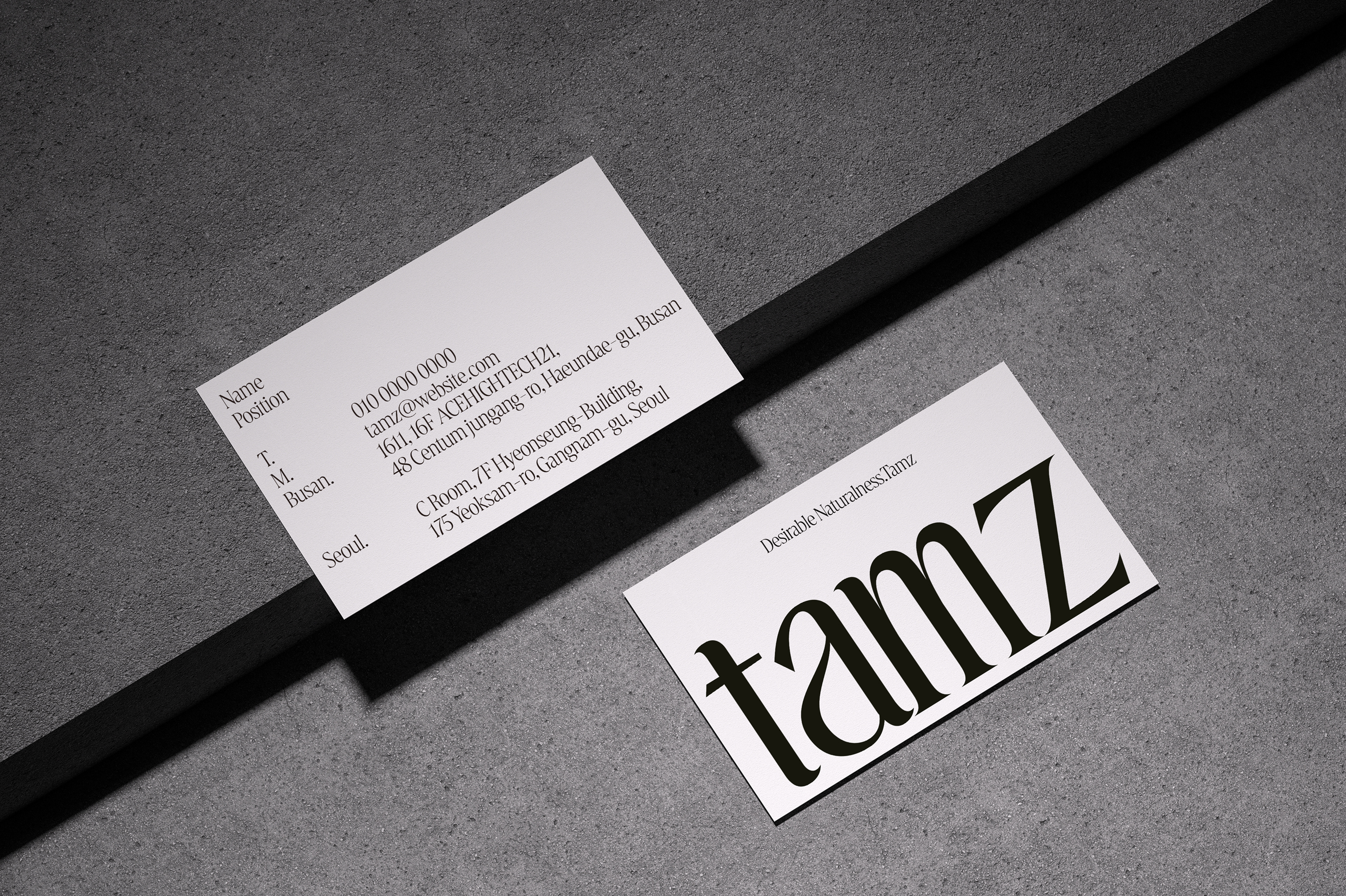
TAMZ's main logo uses a serif font with a soft flow that expresses the texture of a seashell,
and gently conveys the brand's message through gentle movements of similar heights.
and gently conveys the brand's message through gentle movements of similar heights.
TAMZ의 메인로고는 조개의 결을 표현하는 부드러운 흐름의 세리프서체를 사용하며
높낮이가 비슷한 잔잔한 움직임을 통해 브랜드의 메세지를 부드럽게 전달합니다.
높낮이가 비슷한 잔잔한 움직임을 통해 브랜드의 메세지를 부드럽게 전달합니다.


TAMZ's package is reminiscent of clams and fish shells in nature.
The texture expressed is naturally reminiscent of the grain of a seashell and suggests
that there is a shiny and coveted pearl inside,
and the silver paint on the container reinforces TAMZ's special design and brand identity.
The texture expressed is naturally reminiscent of the grain of a seashell and suggests
that there is a shiny and coveted pearl inside,
and the silver paint on the container reinforces TAMZ's special design and brand identity.
TAMZ의 패키지는 자연속의 조개 및 어패류 껍질을 연상하게 합니다.
질감으로 표현된 텍스쳐는 자연스럽게 조개의 결을 연상하게 하며
안에는 반짝이며 탐나는 진주가 존재하고 있음을 암시하며
용기는 실버의 도색을 통해 TAMZ만의 특별한 디자인과, 브랜드의 정체성을 강화하고있습니다.
질감으로 표현된 텍스쳐는 자연스럽게 조개의 결을 연상하게 하며
안에는 반짝이며 탐나는 진주가 존재하고 있음을 암시하며
용기는 실버의 도색을 통해 TAMZ만의 특별한 디자인과, 브랜드의 정체성을 강화하고있습니다.


Client : TAMZ
Brand Design : Office Bari
Brand Design : Office Bari
Package Design : Office Bari
Visual Director : @zoaehalfhalf @hoyeon Shin